Menu Redesign

Working with simplistic layout

and illustrations.

MENU Design

BRAND IDENTITY

Challenge

TRAMO is a Michelin Star restaurant located in Barcelona, Spain. Known for their farm-to-table organic product, contemporary dishes and stunning architecture, their brand leaves a lasting impression. However, their menu does not reflect the same care and creativity as the rest of the brand. This project allowed me to dive into the function and aesthetics of menu design.

Stephen Mayer, a Salt Lake City native, was nurtured in the publishing world by his magazine-running father and developed a fascination for fonts upon receiving a Mac for his family. During his collegiate years, he skipped lectures and gained knowledge about typeface—and life—by working as a designer for his university newspaper.


He also worked independently as a consultant, bridging the gap between typeface creators and users, always championing the needs of both parties. Not only is he the co-founder of the web platforms, Typographica and Fonts In Use, Stephen has also penned a regular column for Print magazine and authored the acclaimed book The Anatomy of Type. In 2017, he became an integral part of the nonprofit library and museum, Letterform Archive, as an Associate Curator and Editorial Director.

Solution

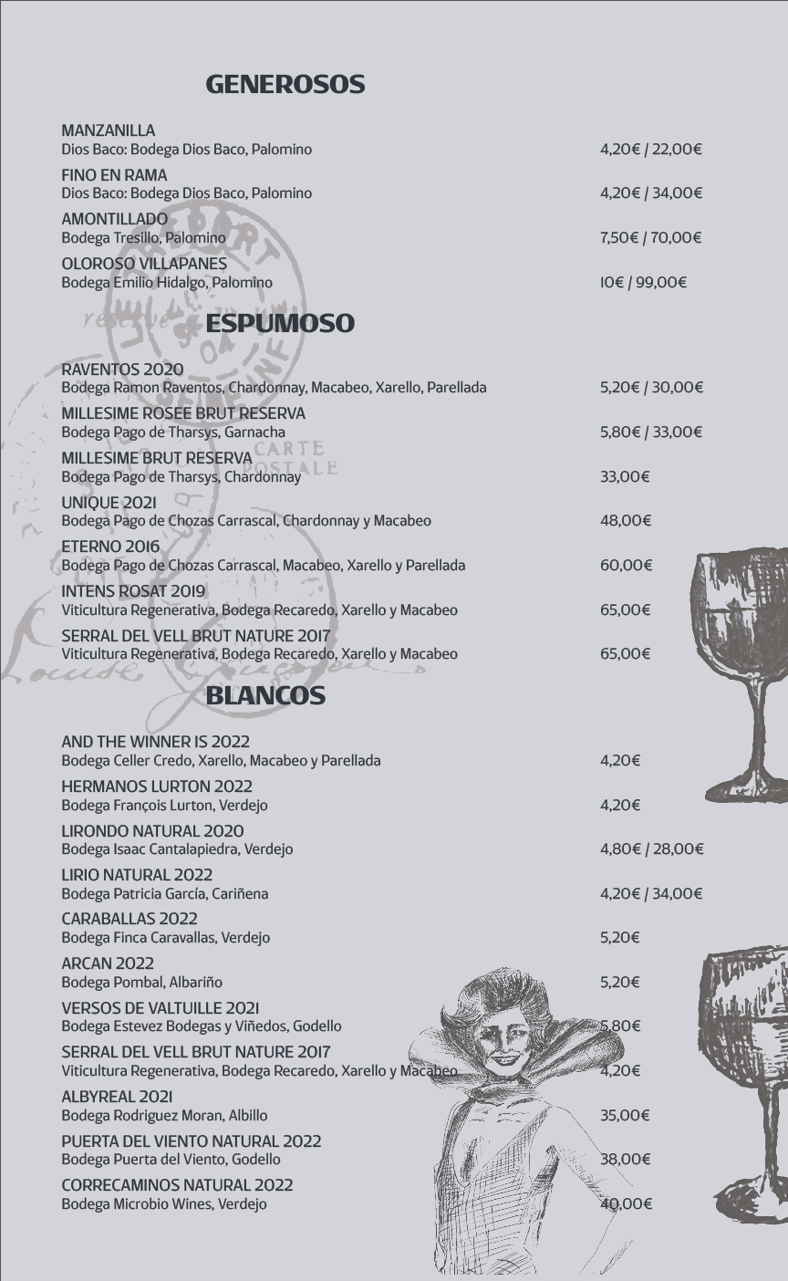
Using hand drawn illustrations of my own grandparents, who both originated in Spain, and icons referencing Spanish history, I was able to make the menu more dynamic. Paired with an alternate color palette the resonated with the buildings architecture, I created a menu stack that better paired with the restaurants atmosphere and more efficiently organized.

Stephen Mayer, a Salt Lake City native, was nurtured in the publishing world by his magazine-running father and developed a fascination for fonts upon receiving a Mac for his family. During his collegiate years, he skipped lectures and gained knowledge about typeface—and life—by working as a designer for his university newspaper.


He also worked independently as a consultant, bridging the gap between typeface creators and users, always championing the needs of both parties. Not only is he the co-founder of the web platforms, Typographica and Fonts In Use, Stephen has also penned a regular column for Print magazine and authored the acclaimed book The Anatomy of Type. In 2017, he became an integral part of the nonprofit library and museum, Letterform Archive, as an Associate Curator and Editorial Director.

More

Closing Thoughts

The addition of the illustrations created more depth to the items listed and made the pages much more dynamic than the original design. Although I would most likely modify the background colors of the pages, the hues create a beautiful series to take the guest through their meal.

tools

Adobe Photoshop

Adobe Illustrator

Adobe InDesign

Procreate

process

Class

Typography 2

Research

  • Restaurant Design

  • Alternative Menu Design


Typefaces

  • Logo

    • Shabby Chic Regular

  • Header

    • Condor Black

  • Body

    • Rotulo Variable

      Regular

Development

  • Researching Existing

    Micheline Star

    Restaurant Menus

  • Separating Menu

    Contents & Translation

  • Color Scheme

  • Illustration

    Development

  • Organizing Menu Items

    onto Spread

  • Final Edits Made with

    the Addition of

    Illustrations

A product of

Get notified when I release new products
Get in touch

Send an email @izzydinverno@icloud.com and I'll get back to you ASAP

All rights reserved © 2024 fouroom.co

A product of

Get notified when I release new products
Get in touch

Send an email @izzydinverno@icloud.com and I'll get back to you ASAP

All rights reserved © 2024 fouroom.co

Create a free website with Framer, the website builder loved by startups, designers and agencies.